Project Title
Completed in: October 2024
Background
Statera is an app which helps in managing your daily tasks in a
balanced way. It offers a centralized space to manage and track all
your projects, chores and, assignements. At its core it is an advanced
auto-scheduler which ensures that your workload throughout the
week is balanced. Statera offers a way to stay on top of all things and
avoid stressful crunch days.
The intended audience of this app has been pretty wide, basically meant for people doing any sort of projacts and tasks in their professional or student life. Thus the approach taken from the get go is to simplify the information being provided and present it in commonly recognizable methods by altering them a bit.
The goal of the app is to "gamify" the entire process of tracking your tasks, which is already seen as mundane for most people thus I wanted the app to visually feel fun so that viewing/tracking your tasks doesn't incite stress or boredom. To achieve the following I decided to use a much saturated color palette for the secondary elements in contrast to the base elements.
Research
The initial research was to explore the completitors participating in the task management apps industry. This did not lead anywhere as most of them did not use any approach that could be used as an inspiration, they were also pretty mundane. Thus I shifted my focus to find data visuals which were easy to understand and started sketching own wireframes to test for different color palettes.
To find data visuals I wanted to look more into commonly recognized data visuals, thus rather than looking at specific apps and services I turned to looking at operating systems as they are used much widely. Moreover, data visuals used in operating systems such as windows and ios are going to be instantly recognized by users as they are core part of navigating devices today.
Thus the key elements I decided on using were: lists, calendar, progress bars and line graphs. As these are all elements commonly used in inbuilt apps for windows, ios and android.
Wireframing
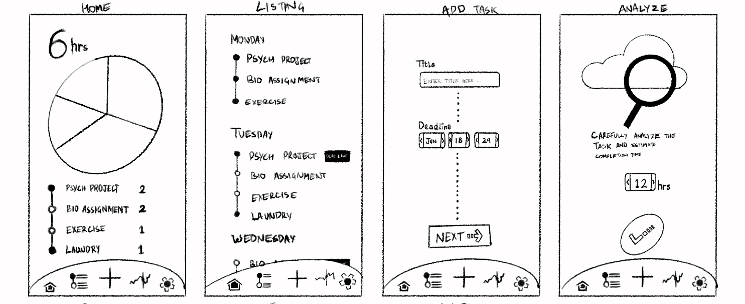
In the initial wireframes I tried decide on the pages to ensure a smooth user flow. The main pages I listed were deshboard/home, listing, adding task, settings and statistics. As I developed these pages I thought further about additional pages to make the entire user flow smooth and seemless.
Prototype
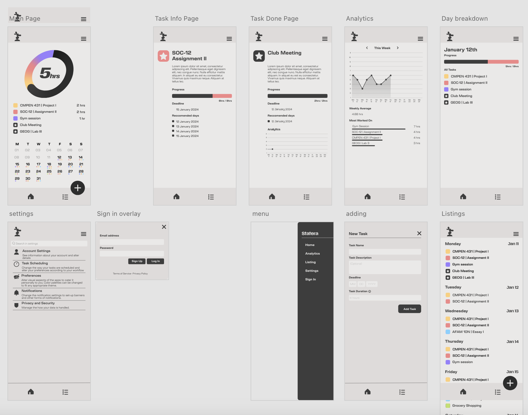
I utilized Adobe XD to develop the prototype, most of the changes made were during these stages. The user flow was refined during prototyping so that the entire app feels complete and true to its goal.
Majority of the stylistic choices were also made during this stage itself, such that the app feels more fun to use from the perspective of a daily user.
Usability Testing
I asked multiple college students to use the interface and note down their key issues with it and challenges. I added more pages based on user expectations, as a lot of users noted that clicking on certain things did nothing when they expected to be redirected to a different page, such as the calendar having information for each day, consequently I added a day breakdown page which the users had expected to be redirected to.
The data visuals were also altered to make them more clear and understandable, so that information is being conveyed without any friction.
Final Design
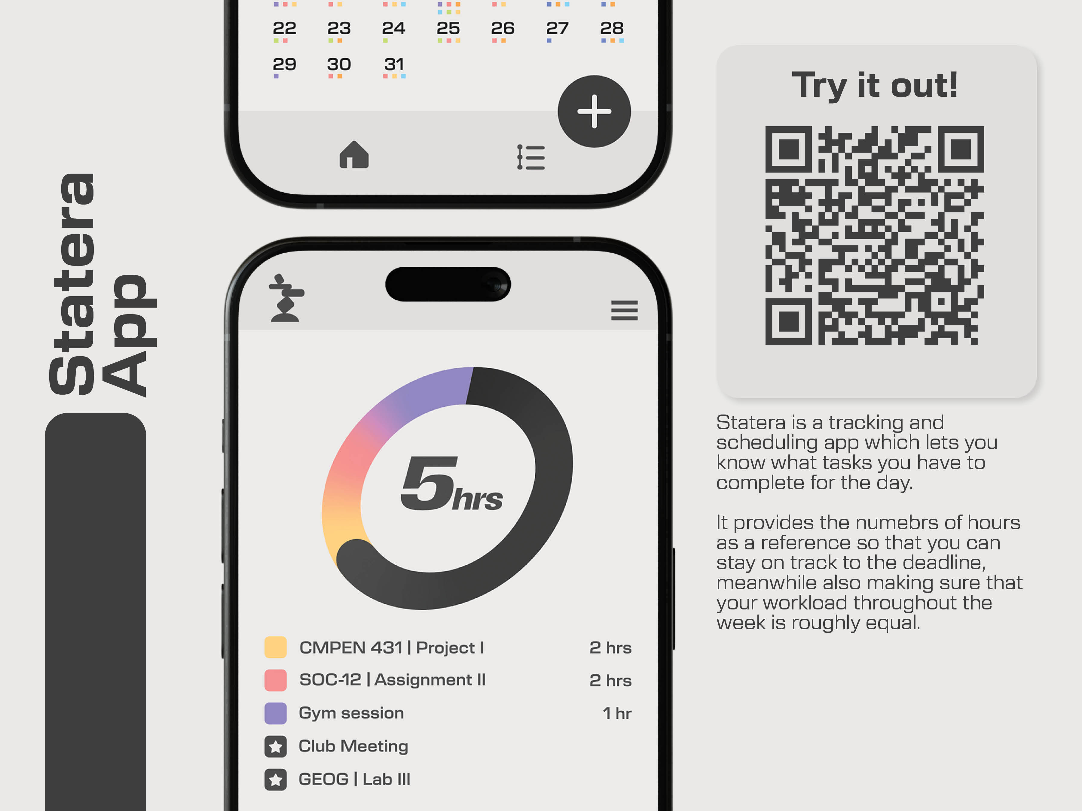
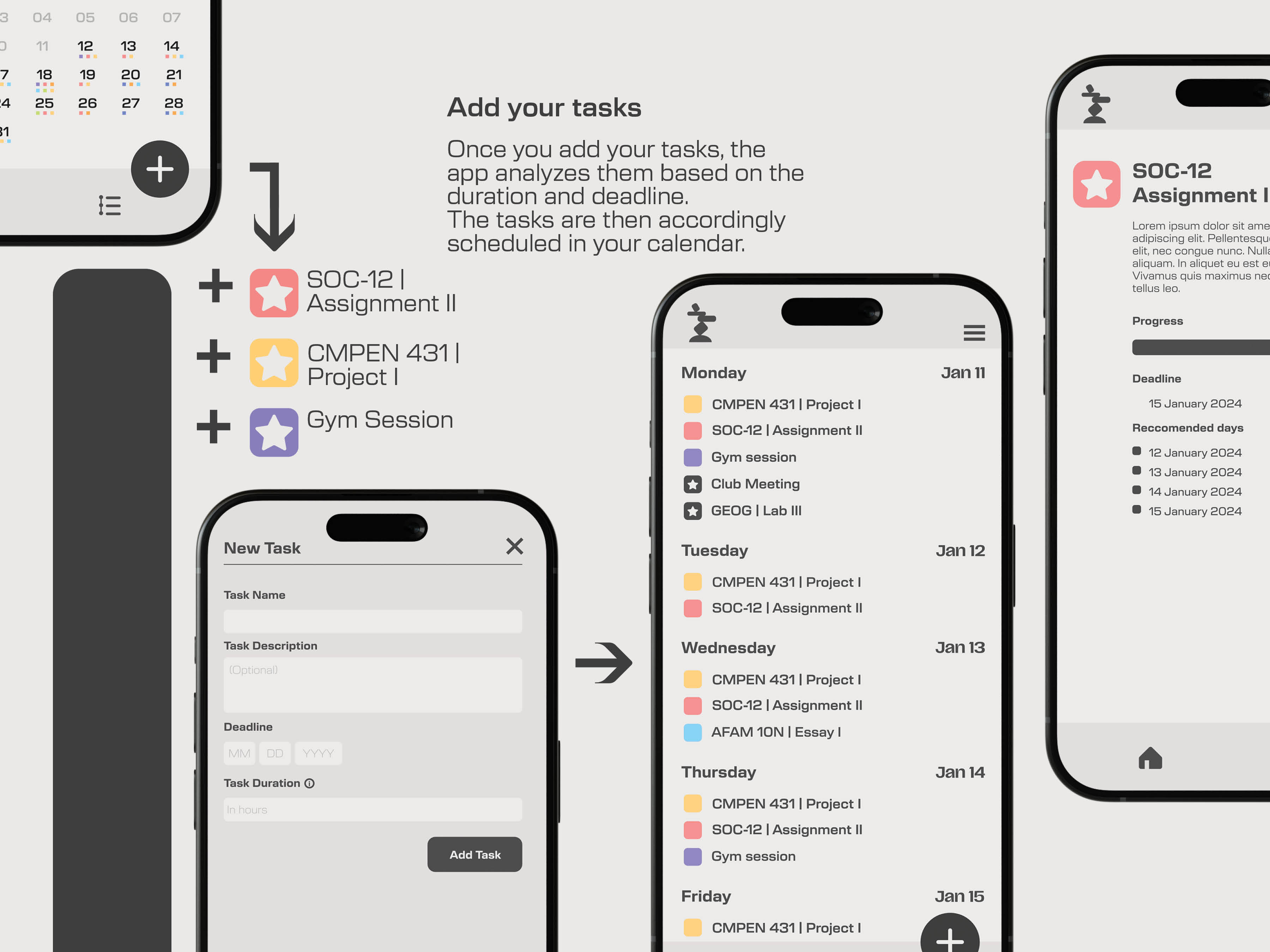
The final design is a near-complete application, ready to empower users in managing their time and work more effectively. Every element—color palette, typography, icons, and layout—has been carefully curated to create a cohesive and harmonious user experience. Through multiple iterations and constructive feedback, the app has evolved into a polished product that, once developed, has the potential to be seamlessly adopted in the market.
Reflection
The project’s evolution over time was one of its most rewarding aspects. With each round of user feedback, the design became more refined and cohesive, ultimately creating a product that feels complete and thoughtfully crafted. By the end, I was genuinely satisfied with the result, as all major adjustments had already been made in response to user insights, leaving little to improve.
Additionally, I have been developing the backend as a website using MySQL, Python, and HTML, and it is progressing well. This dual approach has provided valuable experience and reinforced my confidence in the project’s potential. I hope to see it released as a fully functional application in the future. This project has been a significant learning experience, emphasizing the importance of iteration and user-centric design in achieving a polished and impactful product.